The mechanism: every glance is a transaction
You consult your calendar 20–40 times a day. Each look runs the same subconscious pipeline: parse everything visible → filter what’s relevant → notice what’s ignored → feel the density. On a noisy calendar, that pipeline runs slow and ends in low-grade dread — and it runs every time. Simplification works not by changing your life but by making the 30 daily transactions cheap: less to parse, nothing crying wolf, density that reads honestly.
Simplification 1 · Fewer layers visible
Every ticked calendar in the sidebar is another population on the grid. Untick to three or fewer for daily work (yours + the one shared layer that changes your day); the birthdays, holidays-of-two-countries, and sports feeds return on demand. This is the highest ratio of stress-removed to effort-spent in the whole list — thirty seconds, permanent.
Simplification 2 · Only true things on the grid
Aspirational blocks ("Learn Rust??"), long-dead holds, events you know you’ll skip — each one is a micro-negotiation at every glance ("should I…? no… but…"). The rule: the calendar shows commitments; hopes live on a list. A weekly five-minute fiction-purge (Friday) keeps the property; the stress relief of a grid where everything is real surprises people more than any other change here.
Simplification 3 · One notification you trust per event class
Redundant alerts (desktop + mobile + email for the same meeting) train you to dismiss all of them — which quietly re-assigns the remembering job back to your anxious background process. One tiered, trusted channel (1 min internals, 15+1 externals) lets that process finally stand down. The stress wasn’t the alerts; it was not believing them.
Simplification 4 · Views that match questions
Month view for daily use is an anxiety generator — thirty days of density to feel, zero of it actionable now. Set the default to Day (Settings → View options), use Week deliberately for planning sessions, and hide weekends if you never schedule them. The question "what’s happening now-ish?" deserves a view that answers only that.
Simplification 5 · Color as calm taxonomy
Six-plus colors chosen ad hoc make week view read like a threat display. Reduce to a handful with meanings (external / internal / focus / personal) — the palette becomes a report ("heavy external week") instead of noise. Fewer colors is literally lower visual arousal; the taxonomy makes what remains informative.
What simplification doesn’t fix
Honesty clause: if the load itself is unsustainable, a clean interface shows you that more clearly — which is useful, but the fix is subtraction (decline, shrink, renegotiate), not display settings. Simplify first anyway: decisions about real overload are easier to see, make, and defend on a grid that tells the truth plainly.
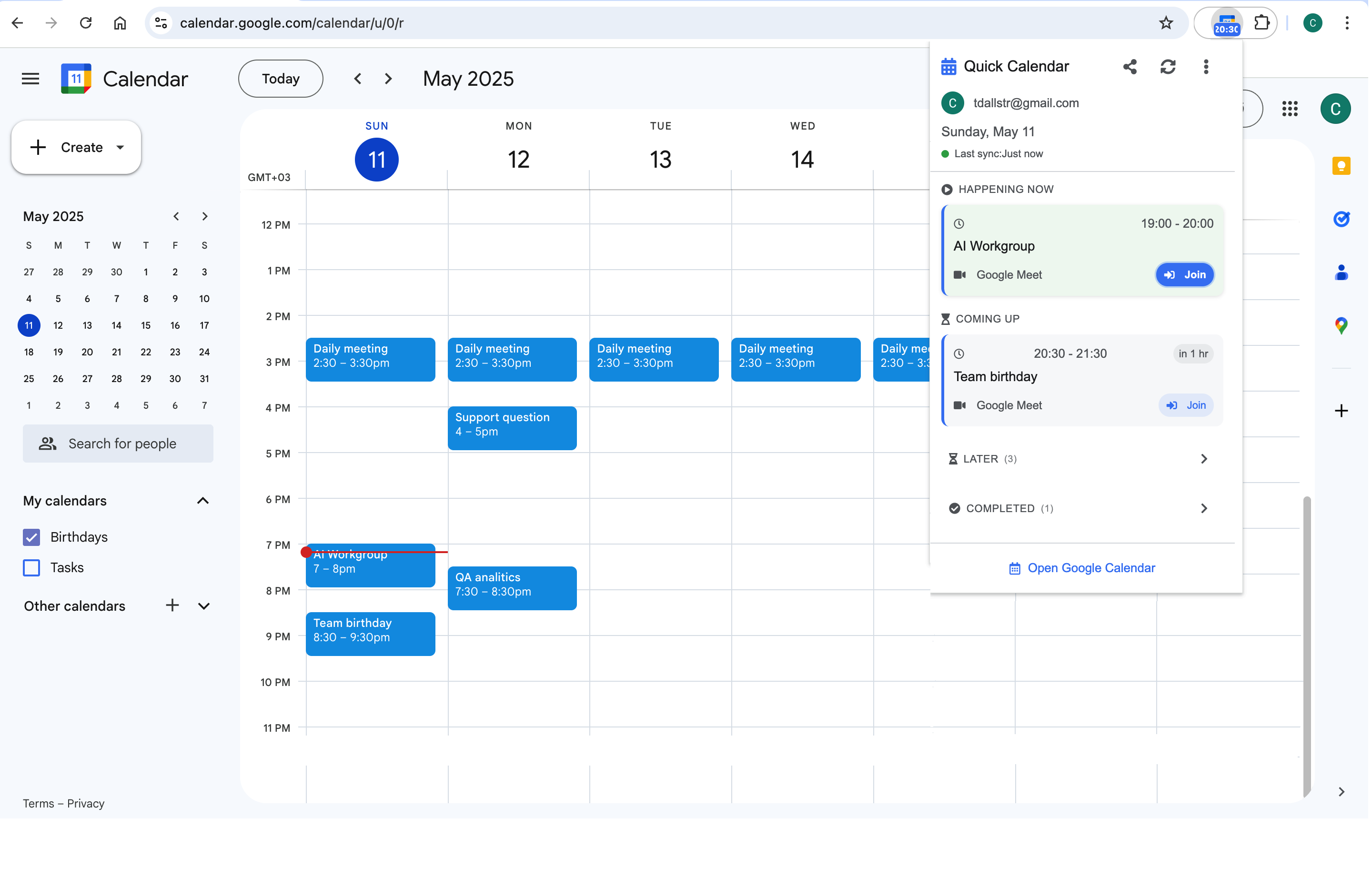
The transaction logic extends to the surface itself: a toolbar glance at a clean day strip — what Calendar Extension for Google Calendar™ renders in one click — is the cheapest possible version of the 30 daily checks. Simple calendar, simple surface: the pipeline that used to end in dread ends in an answer.
Frequently asked questions
Common enough to have a pattern: the Sunday-evening scan, the re-checking loop, the dread-at-density feeling. Schedule overload is stressful on its own, and the interface multiplies it by making every look a re-experience of the whole load.
Hiding ≠ deleting: notifications still fire from hidden layers, and one tick restores visibility for the moment you need it. The design principle is progressive disclosure — everything reachable, only the daily-relevant visible. You miss things on noisy grids, not clean ones.
Two: the invitation gate (Settings → "Add invitations: only if sender is known") stops strangers writing to your grid, and processing invites on arrival with the 10-second triage (accept / shrink / decline-with-note) prevents the anxious backlog. Invite dread is mostly unprocessed-decision dread.
No — anchors are true commitments and belong on the grid (Simplification 2 protects them explicitly). What goes is the aspirational clutter around them. A calendar with meetings, three anchors, and honest blocks is simple; simple was never the same as empty.