The map: question → view
"What’s happening now-ish?" → Day (D). Full temporal resolution, every overlap legible, the only view where a packed afternoon reads honestly. The right default view — set it in Settings → View options → Default view — because most opens are this question.
"What shape is this week?" → Week (W). The planning lens: density patterns, focus-block survival, which day is the wall. Also the misleading daily driver — at week resolution, short events compress into unreadable slivers, which is why week-campers over-schedule 30-minute slots they couldn’t see were adjacent.
"What’s my horizon?" → Month (M). Deadlines, travel, the deep-work desert of late March. Month view shows existence, not extent — a day with one all-day item and a day with nine meetings look similar — so it plans milestones well and days terribly.
"What’s coming, in order?" → Schedule (A). The linear agenda: no grid, just the sequence. Underrated on desktop, essential on mobile — and the kindest view for dense calendars, since it never renders overlap chaos, only order.
"The next few days, precisely?" → 4-day / custom (X). The sleeper. Settings → View options → "Set custom view" configures X to 2–7 days; at 4 days it holds today’s resolution plus a planning horizon, minus the weekend noise. A large share of week-view campers, once shown it, never go back.
Settings that sharpen every lens
- Hide weekends (Settings → View options) if you never schedule them — week view gains 28% horizontal space for the days that matter.
- Reduce brightness of past events — the single best legibility toggle: everything already over fades, and "what’s left today" pops in any view.
- Show declined events: off for daily use — ghosts clutter every lens (flip it back on for archaeology).
- Custom density/color settings aside, the keyboard is the real setting: D/W/M/X/A/T make views free to switch, which is what turns "my view" into "the right view per question".
The two-lens habit
Effective calendar use settles into a rhythm: Day (or 4-day) as the resident lens, switched to Week deliberately for the Friday reset and any replanning session — then back. Month gets opened a few times a month for horizon checks; Schedule serves mobile and dense-day sanity. The anti-pattern is the inverse: living in Month (anxiety with poor resolution) or planning in Day (no shape visible). Match the lens to the question and each view is excellent; mismatch and every view is bad.
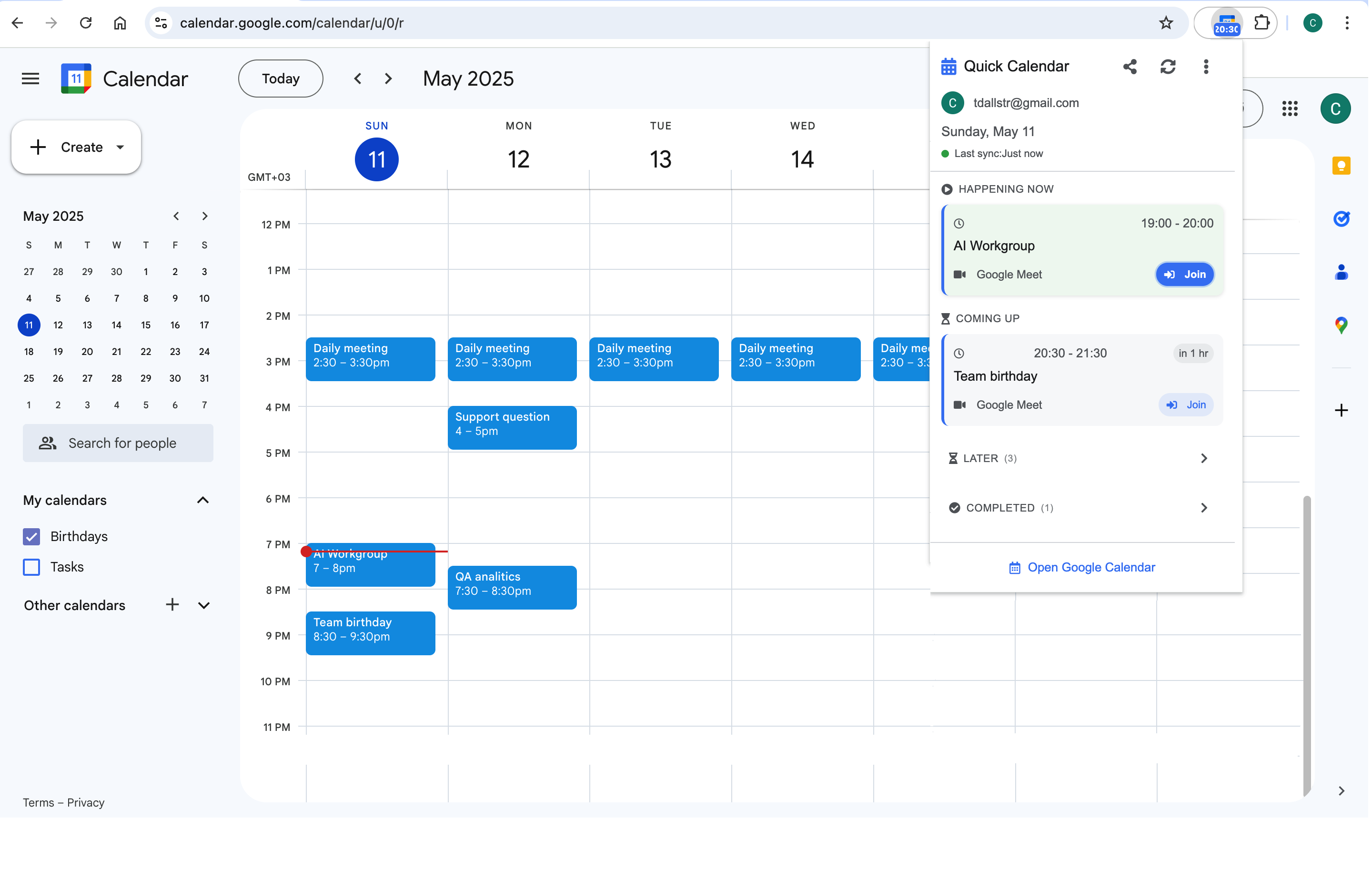
There is a sixth lens the tab doesn’t offer: the two-second one. For the "what’s next / how long" checks that make up most calendar opens, a toolbar strip like Calendar Extension for Google Calendar™ is effectively a dedicated now-view — one click, no navigation, leaving the tab’s lenses for questions that deserve a session.
Frequently asked questions
Twice a year, literally: vacation planning against public holidays, and quarter-boundary sanity checks. It renders only date awareness — no events beyond dots in some contexts — so treat it as a wall calendar, not a working view.
Settings → View options → "Start week on" (Saturday/Sunday/Monday). Regional defaults set it, and a Sunday-start grid quietly misleads Monday-start brains during planning — one of those thirty-second fixes people live with for years.
Day view renders overlaps side-by-side with the most width per event; Schedule view sidesteps rendering entirely by listing them in order. Week view is worst — overlaps become slivers. Chronic overlap pain is also a hint the calendar itself needs triage, not just a better lens.
No — the default view is account-wide. The workable pattern for people who want "planning calendar in week, daily calendar in day" is the keyboard rhythm instead: the default serves the frequent case, and the one-key switch (W) serves the session.