Set the app up for glances, not sessions
- Default to Schedule view. The hamburger menu → Schedule shows a scrolling agenda — the "what’s left today" answer with zero pinch-zooming. Month view on a phone is a decoration; Schedule view is an answer.
- Cut the visible calendars. Menu → tick only your own calendar plus whichever shared one changes your day. Every birthday-and-holidays overlay you hide makes the ten-second check two seconds faster.
- Prune mobile notifications separately. The app has its own notification settings per calendar (Settings → your calendar). If desktop already handles reminders, keep mobile to externals and all-day items only — double banners train you to swipe both away.
The widget is the actual product
The fastest mobile check never opens the app: a home-screen widget showing the next two events answers "when am I due" from a pocket glance. On Android, long-press the home screen → Widgets → Google Calendar → Schedule widget; on iOS, long-press → the + button → Calendar (the "Up Next" size). Put it on the first screen — a widget you have to swipe for is an app with extra steps.
Three app tricks that earn their place
1. Type times, skip the pickers
When creating an event, the title field parses nothing — but you don’t need it to. Tap the time row once and type instead of scrolling the wheel; better, front-load event creation to desktop where quick-add exists, and keep mobile creation for the "dentist, Thursday 3pm" cases where the widget prompt is enough.
2. Long-press for the fast RSVP
Invites can be answered from the notification itself — Yes / No / Maybe live in the notification actions. The same-day invite you receive on the train does not need the app opened; it needs a decline with your thumb.
3. "Ask to join" beats hunting for links
Event cards surface the Meet/Zoom join button at the top when a meeting is close. If you routinely join calls from the phone, this — plus the widget — is the whole workflow; the calendar grid never enters into it.
What not to do on the phone
Weekly planning, rearranging a broken day, writing real agendas — all of it costs three times more on glass than at the desk and produces worse decisions. The productive division of labor: the phone answers questions; the desktop makes plans. Any mobile session past two minutes is usually a desktop task happening in the wrong place — leave yourself a one-line task note and do it properly later.
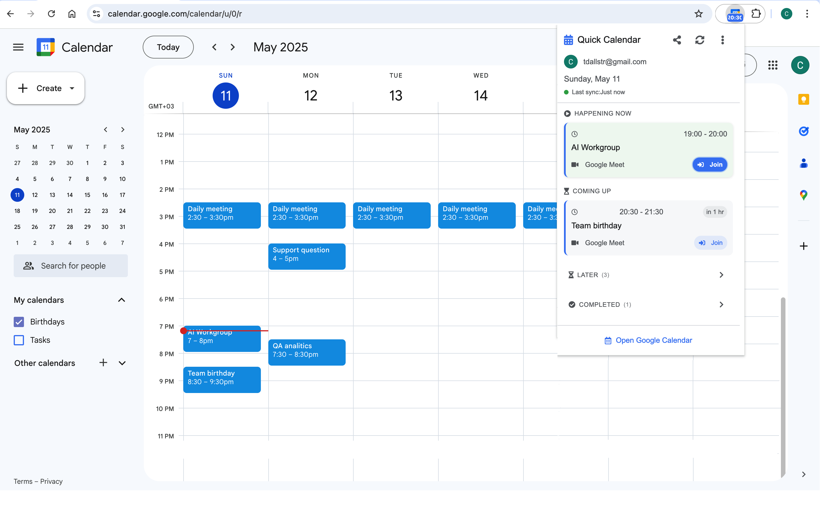
The same glance-first logic applies back at the desk: opening the full calendar tab to answer "when is my next meeting" is the desktop version of pinch-zooming month view. A toolbar popup like Calendar Extension for Google Calendar™ is the desktop widget — today’s timeline and join links, one click, no tab.
Frequently asked questions
Almost always calendar visibility, not sync: each device keeps its own list of ticked calendars. Check the menu on both and match the ticks. Actual sync failures announce themselves differently — events created on one device that never appear anywhere else — and are fixed by removing and re-adding the account.
The widget is the closest native answer — it shows the next events with start times on the home screen. iOS additionally surfaces calendar events on the lock screen and in StandBy mode; Android shows them in At a Glance on Pixel launchers. None counts minutes down, but the glance math is instant.
For a rare check, yes; as a daily tool, no — no widget, no notification actions, slower loads. The app’s two real assets are exactly the widget and the notification RSVP, neither of which the mobile site can offer.
Google Tasks with dates appear in the app and the widget, which is useful for the two or three that matter today. But triaging a task list on the phone has the same problem as planning: it is a desktop job. Capture on mobile, organize at the desk.